
Seasonal Food Guide (SFG)
When being tactical is the fastest route to strategy.Planning app improvements with no product strategy.
Overview:
Seasonal Food Guide (SFG) is a comprehensive national database of seasonal food available in the United States.
The SFG is designed by the GRACE Communications Foundation to help users discover produce that is “in season” in their state throughout the year.
Both the web and mobile apps for the guides have many UI issues. Web components break when one resizes the screen and the mobile version doesn't support multiple screen sizes (i.e., tablets). Additionally, there are design pattern inconsistencies and usability is overshadowed by over-branding.
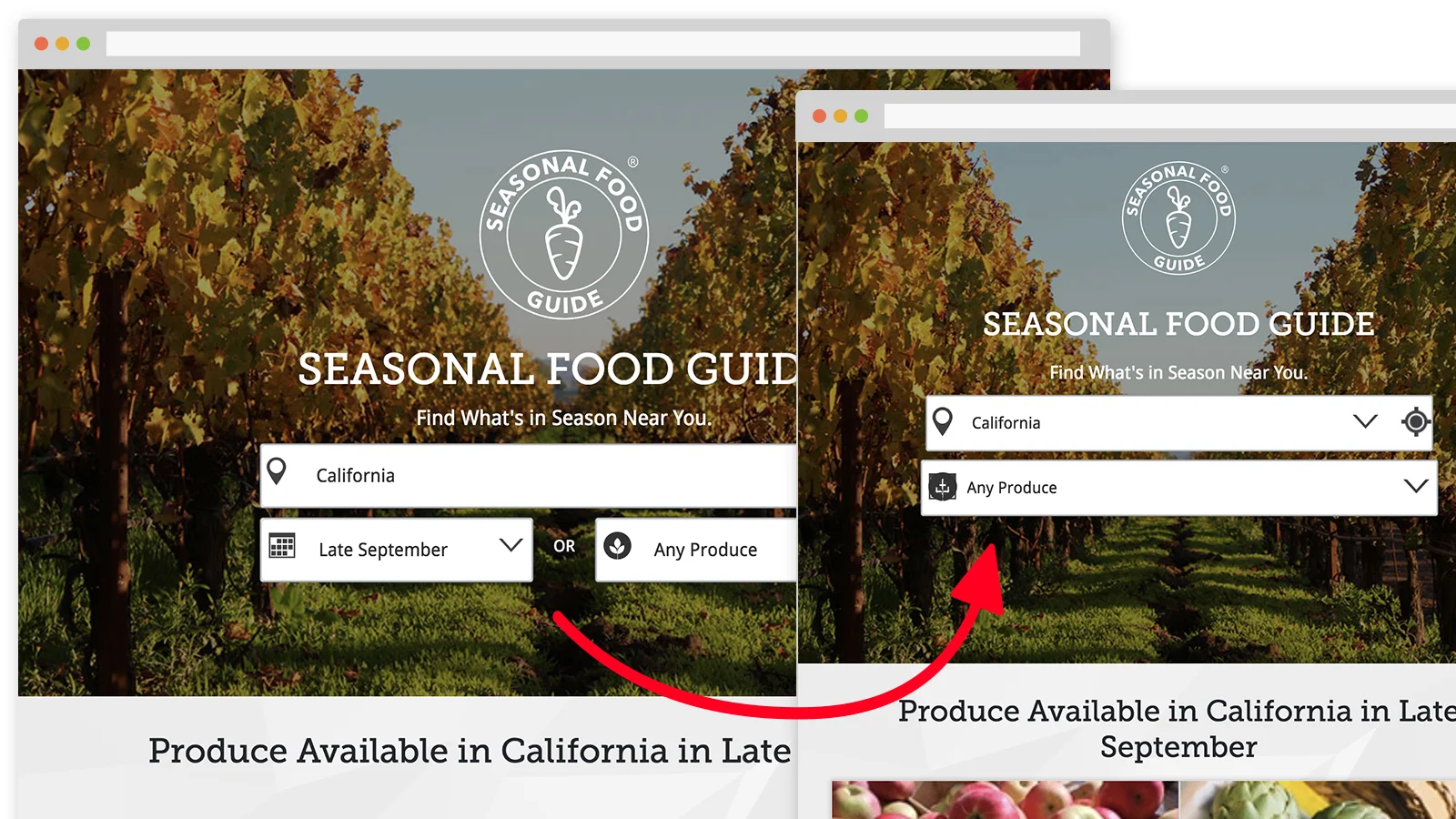
This case study details the proposed plan to improve SFG UI and consequently to clear the way for UX strategy.
Proposed deliverables:
Tactical plan
Strategy & product roadmap
Workshops and documentation
Research
UX documents
Wireframes
Prototypes (low & hi-res)
Design debt inventory
UI inventory
Research synthesis
What I worked on:
Due to pressing deadlines, a shortage of resources, and the organization's management style, my strategy was to introduce a tactical plan to remediate the SFG UI bugs first. This would increase the odds of stakeholders adopting the product strategy and roadmap in the second phase of the project.
I developed an organized, coherent and lean action plan that involved collecting data that later would be used to create the UX strategy and product roadmap.
Challenges:
Information was scarce and difficult to share across teams.
Most of the people who have worked on the project had left the organization.
Low budget and resources.
The design comps and code were cluttered, and documentation was either outdated or nonexistent.
There was no product strategy.
Background:
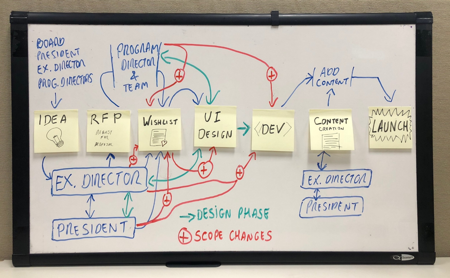
The organization's waterfall product design process has played a significant role in the circumstances that led the SFG to its unreliable state.
Stages of GRACE's waterfall product design process
Idea/Concept
Request for proposal (RFP)
Wishlist
UI Design
Development
Content creation
Launch
Acknowledging this process provided a better understanding of where the issues originated and a sense of where the decisions came from. This methodology also provides guidance in the appropriate approach to introduce improvements.
Conclusion:
From a design perspective, this project was missing significant information that is necessary to build a solid UX strategy that paves the way to a successful product.
Yes, it's a UX designer's job to go after this information, but there are other factors that cannot be removed from the equation when defining an approach to a problem. These factors include the project's backstory as well as the organization's constraints, restrictions, and management style.
I chose this approach because I could leverage my design and development background to guide the developer while simultaneously using my UX expertise to gather data to support UI improvements and recommendations.
This case study ends here.
Below is a breakdown of the tactical plan in case you want a deep dive on my approach and thought process.
Tactical plan (breakdown):
Put out the fires!
The developer will prioritize the search form responsiveness issues.
Design debt (1st round) and UI inventory
Document all issues;
Catalog UI components;
Identify the relationship between the problems and elements.
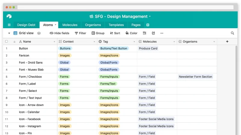
I break the interfaces layout down into their basic components following Atomic Design principles.
This provides a better sense of how things connect to each other throughout the system.
User research — task completion and brand recall
For benchmarking purposes, we'll quantify 1) the brand recall after task completion and 2) the effectiveness of the current app and web interface.
This information will serve as a parameter for future updates.
Goals, metrics, and users
We’ll ask the communications team about the organization's plans and user information.
I'll break this down into two stages: "first goals and metrics" and then "user information." I have a better chance of getting this information if I ask for it in small and paced installments.
User feedback
The communications team loops in the IT team with users' feedback (i.e., app stores, emails, etc.).
Goals, metrics, and users (follow up)
I will assume this information is incomplete, inaccurate, or nonexistent. I'll break this down into two steps to increase the chances of getting stakeholders to collaborate in defining these elements (as mentioned above).
Product team meeting
Establish a recurring weekly meeting with the product team.
User research - brand recall
UI improvement:
The initial screen has the brand name displayed twice. I propose we fix it to make more space for the page content.
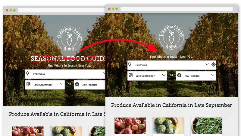
Although this is an apparent redundancy, it’s optimal to validate the proposed design change first and support the recommendation with data. We'll compare the brand recall of the original homepage (with brand duplication) with a leaner version of the homepage (with only one reference to the brand).
Design debt (2nd round)
Add UX notes (assumptions, inputs, recommendations, and observations).
Categorize how far each component is from the original design..
User research - task completion
UI improvement:
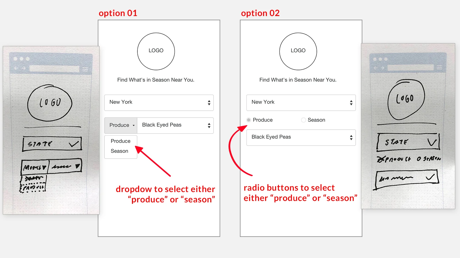
On the main search form, users can select "State" and either "Month" or "Produce." It turns out this is the most problematic UI component; it has poor responsiveness in that it breaks across different screen sizes.
We’ll test other UI alternatives and compare their performance against the original design.
Technical research
Discuss with the developer the feasibility of the UI alternatives;
Define the pros and cons of each one considering scalability, maintainability, reusability, portability (web & app), extensibility, and complexity to execute.
Team alignment
Communicate to the team and stakeholders the newly defined:
Goals;
Metrics;
Users.
The objective is to get everybody's commitment.
Metrics
Start tracking and monitoring the new metrics.
Design update
Adjust and refine UI comps according to Bootstrap constraints;
Improve UI for responsiveness.
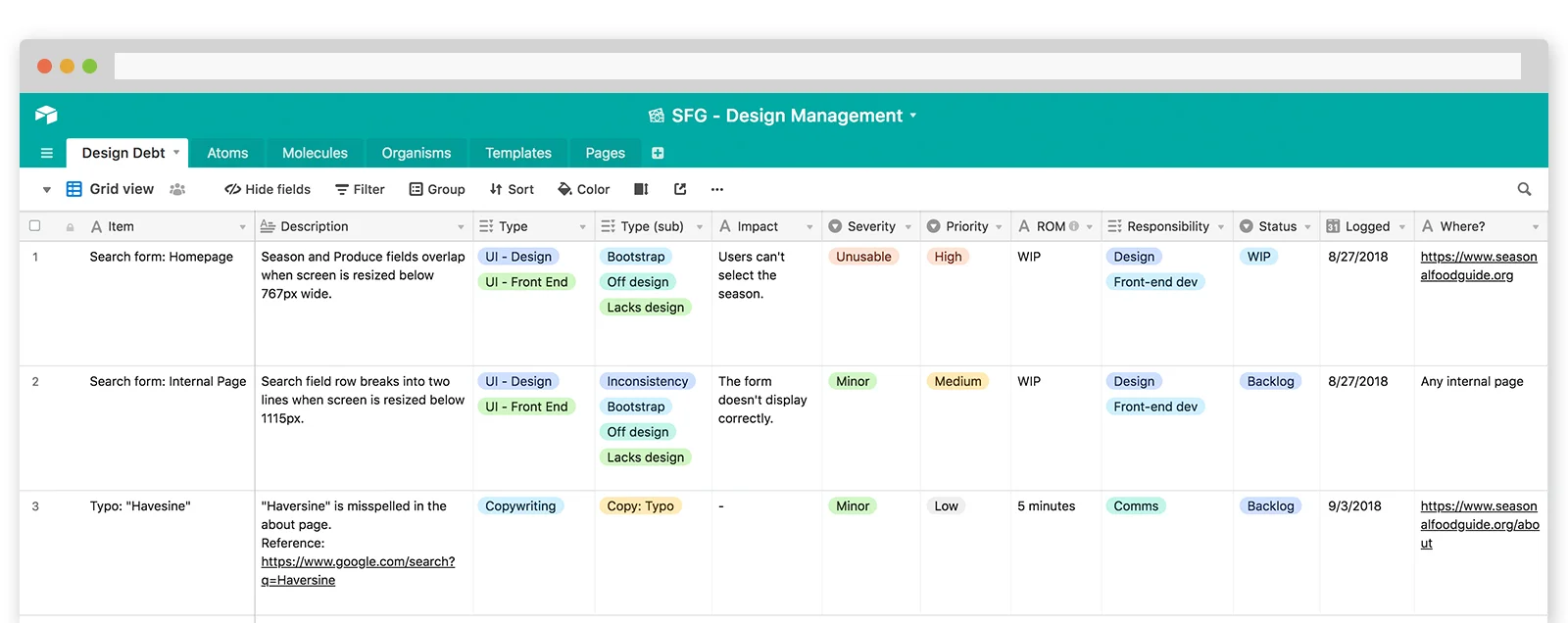
Design debt (3rd round)
Rank each issue according to:
The impact it will have on the user;
The level of effort that’ll go into getting it fixed.
UI improvement sign-off
Present to stakeholders prototypes with refined UIs and the search form improvement recommendation along with the research data.
Design update
Implement changes to design comps.
Workshop (roadmap)
Prepare and present a workshop to introduce the concept to the team.
Cover the hybrid roadmap model (it has a timeline but no hard dates).
I know that the SFG roadmap will become a no-dates model, but stakeholders will have a better grasp of the concept by looking at a timeline. The hard dates model could be perceived as too “aggressive."
Users feedback (2nd round)
Catalog and categorize users’ feedback.
Development and QA
Implement and release search form updates.
Roadmap
Once the main UI issues are fixed and the new version is released, I'll leverage the momentum to guide the team through the process of creating the SFG roadmap.